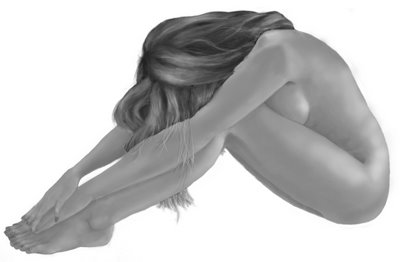
 I dropped the color information here so I can do tonal analysis. It looks boring... hence my tonal values need work. Had I done the tonal values correctly, this should be a little more visually exciting than it is now. This Padawan has much to learn. lolz.
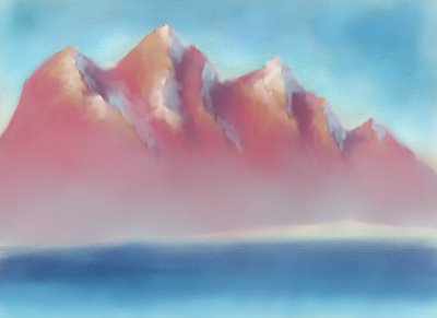
 Here's a WIP I started last night. It's from an excercise in one of my art books. I found his color pallete and usage a little too vibrant for my taste though so I sort of neutered it a bit. Trees will be going into the foreground. Maybe I'll get to finish this later this evening. It's supposed to be a quick excercise but if my OC'ness kicks in... lolz.
I have to guard against my insane compulsion to smudge paint all around my projects. I think I keep overdoing it and they end up looking chalky and dreamy. I guess this guy isn't over those fingerpainting sessions in gradeschool. lolz. There's this part of me that giggles like a child every time I smudge, push, lift, physically(or in this case virtually) blend colors on the canvas(yep digital media has canvases too. :P).
I just have to say this. I love my wacom graphire. It's a good investment. :D
No comments:
Post a Comment