Warning: This post has some nudity in it. I hope Blogger doesn't shut me down because of it. lolz.
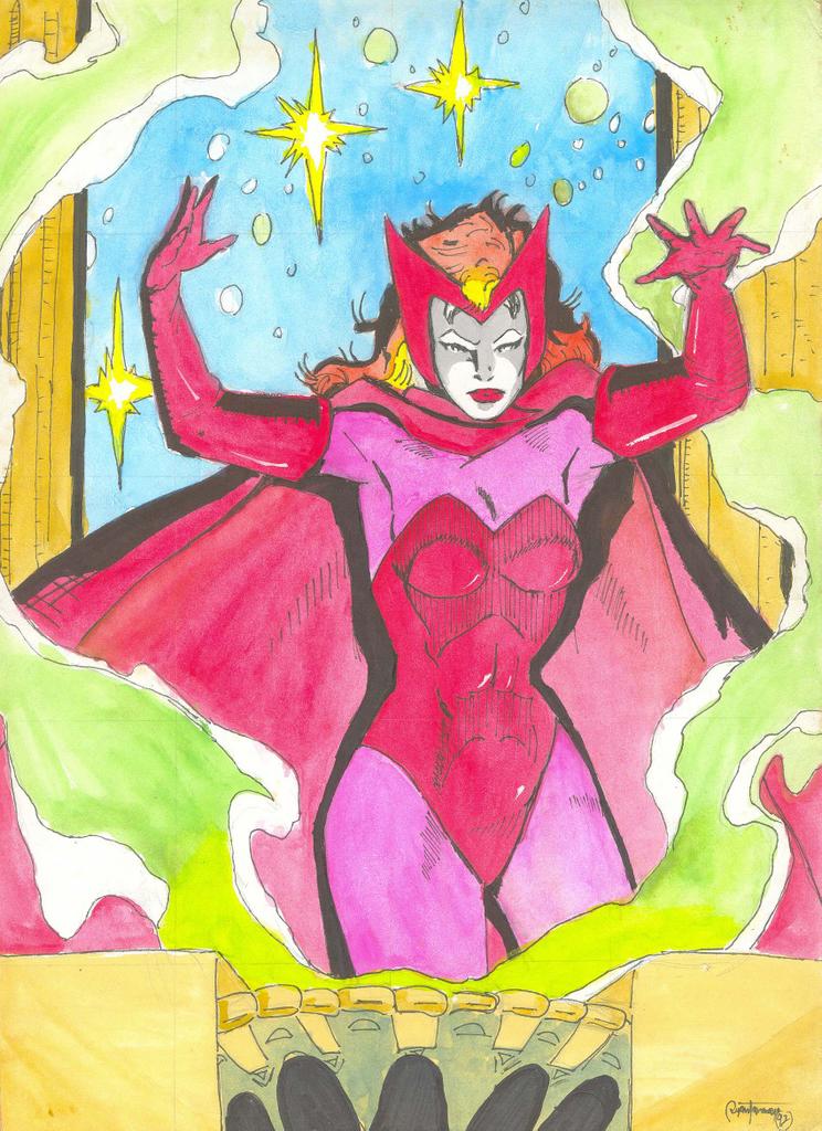
I rummaged thru my old stuff and managed to find some drawings that survived from my younger days. I thought it would be nice to post these in the meantime. These were probably the first two drawings I made in full color. I copied them off the marvel cards that used to circulate before. I made these two with watercolors back in 6th grade. The paper I used then was oslo paper... it feels like tissue now. :D Oh yeah... in those days I didn't know how to draw very well so I did these with the scaling technique(it involves drawing crosshatches on the original and then drawing each part on a per square basis). The cards were tiny and this drawing fill a whole paper. Imagine my shock when I saw someone doing portraits in Robinson's Galleria and he was doing scaling on the pictures...


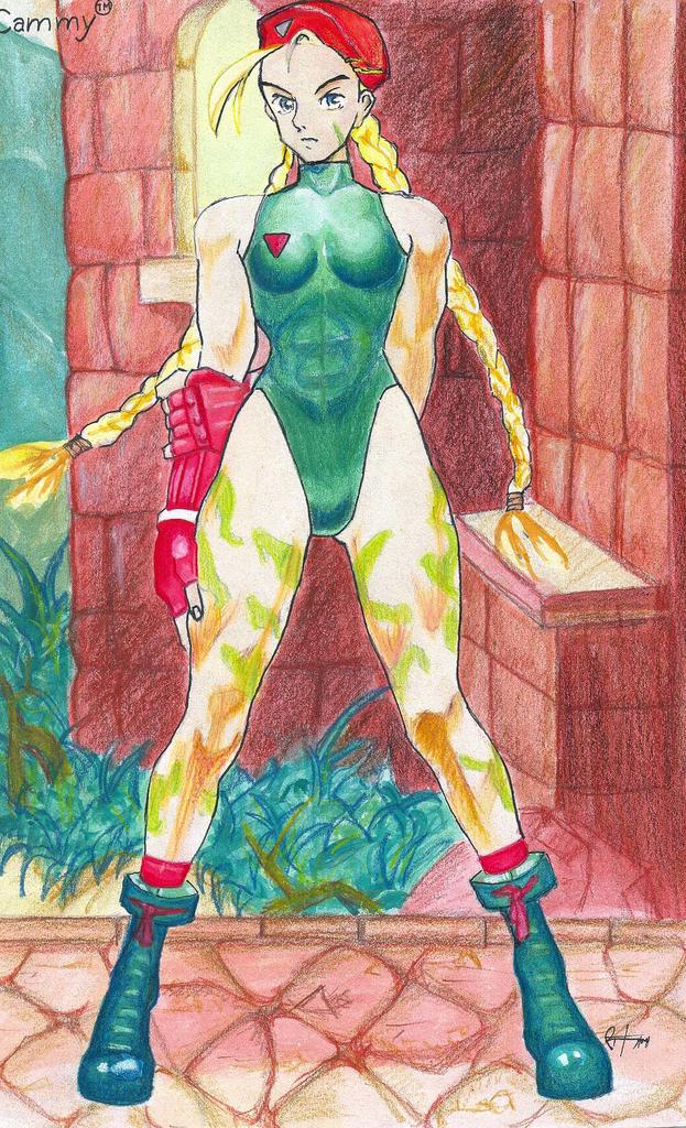
The rats managed to get to these two... sides of the paper were already eaten away. :( atleast the subject is still intact. Cammy and Chun Li from street fighter. It was done in mixed mediums... water colors, colored pencisl and some parts in oil pastels. Now those were my creative days. lolz. These two were done in highschool freshman. That reminds me of Heidi... where in the blazes is that girl. My first muse... we used to hang out together and she was always very timid. lolz.
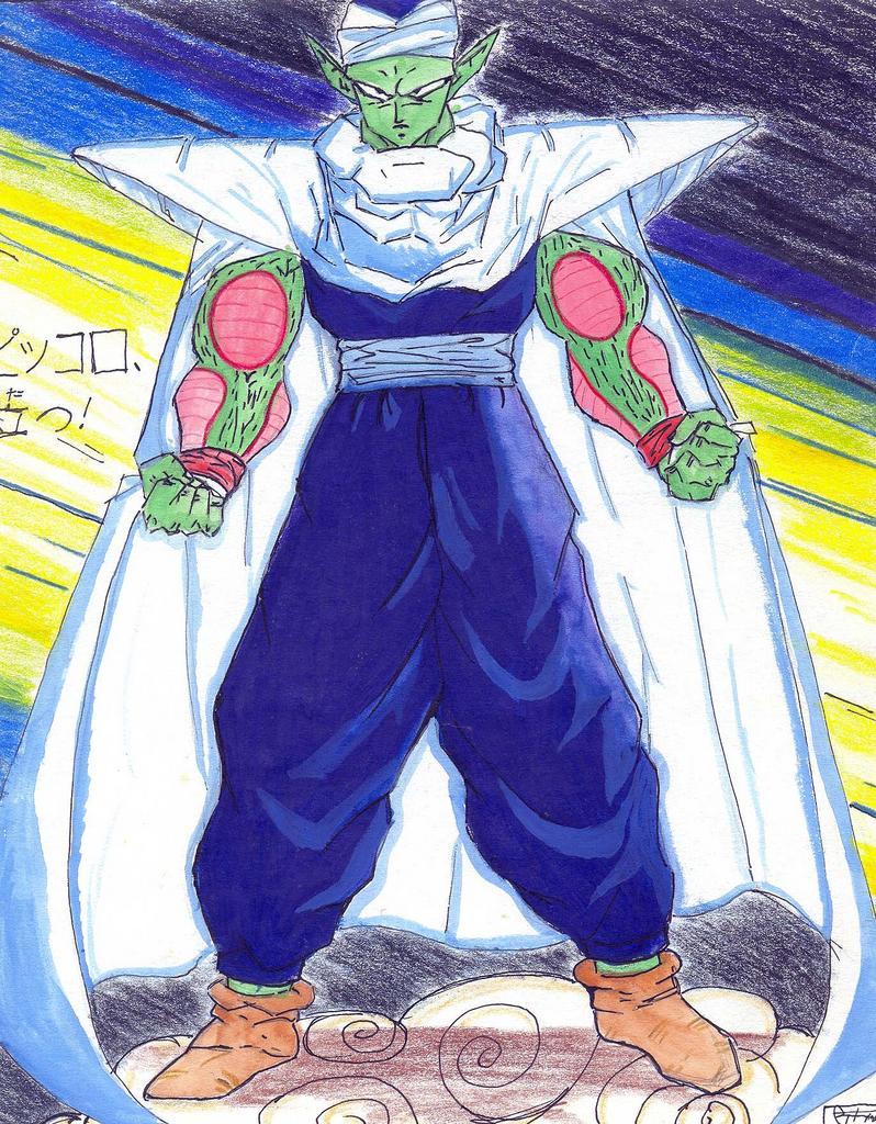
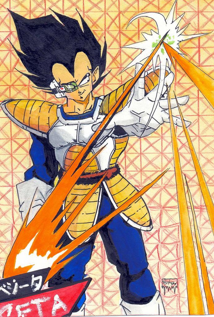
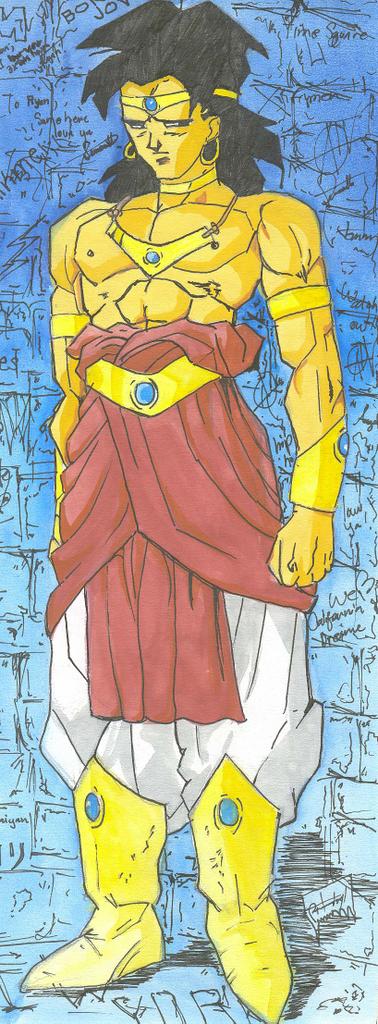
Done during Freshman in highschool too. It was when the Dragon Ball Z craze began. Left to right: Piccolo, Vegeta, Trunks and Broli in his weakest form. Dragon Ball was nice for awhile until they started being too powerful and the plots became too redundant... I remember watching three episodes of the Perfect Cell charging up energy and telling his life story at the same time while our beloved Dragon Ball heroes watched and listened. lolz. Mixed media.
These were from the appearance of the Druuna series on the Heavy Metal comics. The originals were done by Paolo Eleuteri Serpieri. He's an italian(?) erotic artist. The comic series itself was extremely pornographic though... I did these in watercolors. I was in 2nd year highschool then... I remember coz that was also the first time I recieved love letters from a girl. Yup... imagine my shock. lolz.
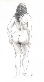
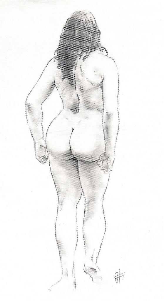
These two I made in Sophomore Highschool. They were the last drawings I made in highschool before I stopped drawing. They were also the best ones in my opinion. The last 2 were copied from Image Comic's swimsuit edition. The one of Psylocke was from one of X-men Comic's R&R issues. I did these in watercolors. I had the last two laminated. This funny incident happened at school... I was in Home Economics class when I brought it out and all my classmates flocked to my seat and everyone was giving the Ooh's and Aah's when the teacher came in to ask what the commotion was about. She saw my drawings and looked at me with disdain as she was telling me that i should not bring "Pornographic Materials" in school. She confiscated them and I had to beg her in order to get them back. After two days she was convinced that they were my drawings and she gave it back to me... After that day, I had to hide in the CR everytime there was an art contest and the teachers would look everywhere for me. lolz. I hated competing. :D It added so much pressure on drawing and I always ended up staring blankly at my paper. Add to that the winners were always abstract works of art... far from my line coz i've always been strongest on the impressionist and realism techniques... I never liked abstracts... not that I can't appreciate it. :P

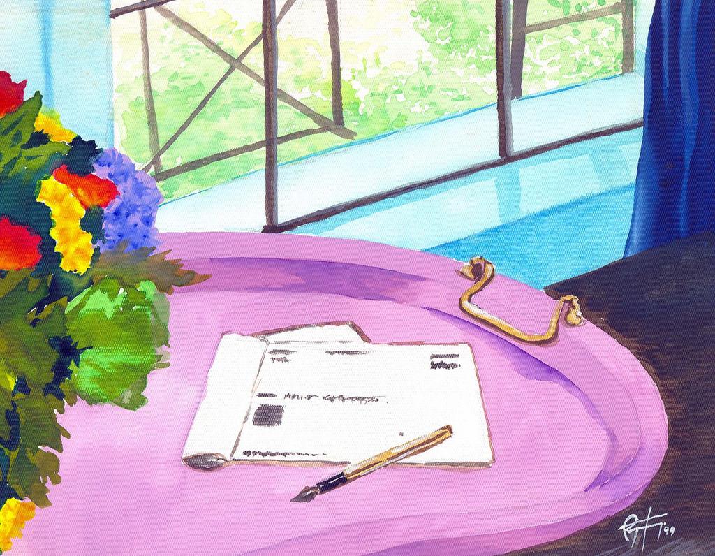
These were the only two paintings I made in College... somewhere around 4th year I think. The first pic was from an Ad for a bank... I just liked the colors. I did that one in water colors, on a now extinct paper. lolz. The second one was also from the Druuna collection by Seripieri. It was done on the same extinct paper... I wonder what happened to the manufacturer... You could use that paper on anything... Watercolors, Pastels, Charcoal... anything... it even gave a canvas like finish.

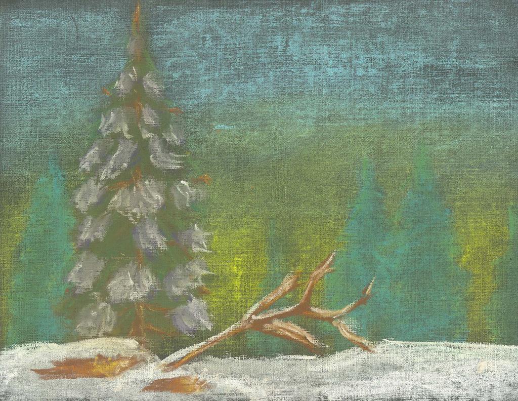
This I did about a few days ago. I made the stupid mistake of using a black paper for a snow scene. lolz. Nothing fancy... I did this doodle in less than 30 minutes. lolz.
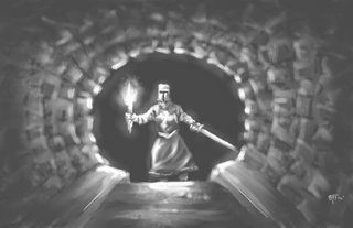 Dark Catacombs. One of the speedpaints I did for a friend.
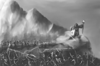 The Necromancer. One of the two speedpaints I did for a friend.
 Winter in the City. It was based of a reference pic.
 Zamboanga fishermen at 1:00 a.m. in the morning. This was from an R&R trip.
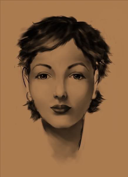 Quick Sketch of a face. No references.


