Welcome to my online gallery. I hope you have as much fun looking at my paintings as I had making them. Enjoy and thanks for visiting! [This site is best viewed witha a 1024x768 resolution]

Friday, December 15, 2006

A reason to be jolly

Another year came and is nearly going and we're all wiser from a year's worth of experience. It's drawing to a close, this page of in the book that is our lives. Everyone's so busy getting ready to write the final paragraphs, dotting every i's and crossing every t's.

For that matter so am I. This christmas vacation will be a time for work. A time when I can finally sit long enough to finish paintings in a day and revisit some old ones that need completion. Hopefully I will have a bigger volume of work to show by the start of the following year. May you enjoy looking at them as much as I enjoy making them. It is with this in mind that I must now turn the lights off on this little corner of the net that I call mine. Only for a little while of course. Every artist needs to sign off from the world for a bit or we will never get things done.

So this is me thanking you all for a year of good companionship and pleasant surprises. A year of firsts. A year of good experiences, of bad ones, and the lessons we've learned from them. A year of love and a year of loss. A year full of life.

Merry Christmas and tune in again next year. ;)

Monday, November 27, 2006

Church Bells and Wedding Vows

Thankfully not mine. :D I have, however been commissioned to do the background for a wedding invitation. This ugly sketch here is the basic idea for it. I just did this in the office with a mouse(booo!).


The scene is supposed to be the silhoutte of two lovers in an intimate pose with a lovely sunset in the background. This is a sketch of a poster in my parent's room. Just trying to get a feel for the work.

On another note I had my niece come over this weekend and I finally got to make her do some excercises that were aimed on being able to see her skills. I made her do a landscape, a figure and still life, which I setup hastily using some old vases and some fruits from a local store(which includes a yummy melon that i feel like turning into a shake sometimes soon). She's a 2nd grader and I think her drawing is much better than most people in their late twenties. lol. So I opted to take her on as my student. She can visualize shadows but not subtle values and she still suffers from typical childish impatience. Still there is much promise in her. Trained early and with a watchful eye she could turn out to be a great artist someday. So the only thing that really bothers me is if I can live up to the task of being her mentor... atleast until she learns all she can from me. Anyways... no better way to do it than to break one's teeth on the wall, to quote miss Serena De Biasi.

******Updated Nov 28, 2006******

So here's a juggled concept of both the picture that the client had and my fumblings at making it more simple. There will be two lovers kissing (or almost) on right side of the beach beneath the setting sun. Still lots to do with this one. I'm kinda struggling with the color consistency a bit. The full size is 5r (7.5" x 5" if we have it right).


******Updated Nov 29, 2006******

Alas the commission was dropped. Anyways far be it for me to not finish what I've started so here it is.

"Lover's Sunset"
7.5" x 5"
Digital Media

Monday, October 02, 2006

Make it stop!!!

Digital Pencils, 22" x 31"

It looks nothing like the reference I used. This is the one I've been working on and off for the past few weeks. It's got lots of issues but I'm stopping this right here... or atleast I'm trying to stop. lolz

Everytime I see the issues I end up working at it and can't put the pen down... I'm likely to super work on this before I have the full size printed. It'll be a custom print because of the unusual size. Kodak actually prints custom sizes but they say it'll take 2 weeks since they have to send it somewhere and pick it up afterwards. The original plan was to do it in color and not in greyscale but I'm having trouble seeing the details of the miniscule ref. For the time being this will remain in black and white.

So I've done portraits and I've done a bit of figure... I think it's high time I get to work on real pieces so I have something original to submit. Jay's suggestion of doing a series sounded good to me so that's what I'll do next...

p.s. she looks like someone my friends know but at the same time tend to not like... XD

-----0-----

friday, October 6, 2006. -- *update*

As we say in my country. Kamote! I can't stop working on this thing. We're having a love hate relationship this girl and me. lolz After getting some good feedback from a friend and CGtalkers I decided to take it up again and keep fixing the issues... also having it printed made me realise it could be a potentially good piece (in an amateurish sort of way). So now I find myself sleeping late and waking up early in an effort to push this piece further in the right direction. Oh and help me but I can already tell I'm going to end up coloring this after the grey scale is finished. Waaaah...

Very messy. Added legnth and girth to some stuff. I think I'll end up rendering as much of the muscle groups as I can so the next print out will look even better... maybe have it mounted. :D

-----0-----
Updated October 10, 2006

Not much to say. Just an update. I have yet to work on both hands and the right leg. Hopefully the remaining issues will be easier to fix.

Monday, September 25, 2006

Rainy Days and Mondays

I haven't posted any miniatures around here for awhile. Maybe coz I haven't been doing them in the first place. :D At any rate, I'm posting this for the meantime while I'm working on another painting. I'll eventually show it when I've got the bloody thing done.

Here's a not so good picture of the details:


Saturday, September 16, 2006

Bleugh!

It looks nothing like the reference picture. Not to mention the obvious mistakes I made while working this piece. In hindsight I shouldn't have add the yellows as it only made an already bad work even worse. I am going to give it another try this weekend.

I actually started out fine laying in the initial washes of yellows, blues and reds. It was when I painted in the violet clouds that things got out of hand. Dealing with a very cloudy sky is still difficult for me. The timing required to do wet in wet painting is a little stiff. Work too fast and the colors just end up dripping, work too slow and they end up drying with hard edges. At any rate... like that old proverb says: "before enlightenment, chop wood and carry water. After enlightenment, chop wood and carry water."


with watercolors... you need lots of patience
with watercolors... timing is critical
with watercolors... you need to buy napkins once a month

with watercolors... the colors are never what they seem
with watercolors... it's not the legnth of your brush but how you use it
and most of all...
with watercolors... you get the best results if you work wet

ahehe...

Monday, September 04, 2006

Back in the day...

So after doing the initial sketch for my original idea on that bather piece I realize the pose looked absolutely uninteresting. I then opted to forego this piece for now and work on something else. After a few minutes of rummaging thru my reference pictures I found an old old image of a nude girl in seated position. I remember asking the photographer Mr. Dan Cardish for this pic. I emailed him after seeing a small thumbnail on it in his website. I told him that I'd like to use it for the painting and he obliged by sending me a larger image of the file. It's still in low res as he took the picture back in mid to late 90's. It was also around that time that I asked him for this picture.

I told myself someday I'd do this painting. Those were the days of my burnout... too many things were happening in my life and I was too distraught to pickup a brush and paint. In my heart though I knew I would always come back to this. One of the three things in life that move me. Now that, to quote a good friend "happy days are here again!" it's time I finally do this and get around to finishing it. ;)

So where's the picture? hehe... that will come in time. I only just began the initial sketch yesterday and there's nothing concrete enough to post. In the meantime I leave you with these horrid looking *things*:


They were all painted with a tiny and ugly genius tablet when 'pen pressure' was a futuristic concept (i think). All done in 99' when I had no knowledge of photoshop(I still can't use it to paint effectively today. :D). The first one was a paintover of an image from, once again, Druuna ;) , the other two are doodles. I used to like comic book and anime styles. I like keeping these things. I can always look back to them and see where I began. Keep my feet grounded. :D

Tuesday, August 29, 2006

How's my hair?


No Title
8" x 8" (ish. :D)
Digital Media


It still has plenty of issues but I'm so over this. lolz. Nah... I'll likely fix it some other time. What started out as a pratice piece turned into a casualty of OCD.

I have to remember to avoid the pitfalls of painting from a photograph in the future. Much lessons learned from this one. I bought a book on anatomy(and on on perspective) to cover my weaknesses. (clavicle vs ryan: clavicle = 1, ryan = 0. lolz) More reading and practice for me. Come to think of it my library is nearly good to go. I just need 3 more books perhaps.

Now I'm gonna get onto that bather... as soon as I can pry my hands off final fantasy tactics...

Tuesday, August 15, 2006

Starting Fresh

I officially ended my vacation last sunday with this image:

I'm still thinking on whether the features line up correctly. I think I've spent around 8 hours just obsessing over the sketch. lolz. Since this is a practice piece before I work on the planned bather for my portfolio, I decided to go ahead with it. I set aside the thinking pose for now. That one ended up looking like an Egyptian catamite. lolz.

This is where I'm currently at. Just managed to pick the palette and lay in the basic light and dark areas last night. I'm thinking of changing some of the colors... particularly the cool shadow which seems more gray than I'm going for. Hope I get far enough tonight so I can keep the time frame for this at 1 week only... I can hardly find time to do these paintings. I definitely have to learn how to paint faster.

Don't grow too attached to the line art. They will all disappear in the later stages. ;)

**********************************Updated 8-16-06 **********************************

Worked more on this last night. This is basically the application of the warm shadow and the cool lights. I think I made a mistake with the process... not so sure if its cool shadows first or warm shadows. Anyway I'll just wing it. The cheeks look really flat right now. Haven't gone into those yet. Maybe tonight or tomorrow night. It is a different band of orange.

This is the first time I've used such bold colors. Usually I keep them somewhat tempered... but I guess I just felt brave. :D Hopefully the image will be more formed when the warm lights have been applied. If it's not then I've done this all wrong and I'd have to go back 3 layers...
--------------------------------------Updated 8-17-06---------------------------------------

Added the warm lights last night. It is starting to take shape. I also clipped the legnth of the nose and cheeks a bit. It's kinda looking like the ref a bit except my work is a little more saturated. I was supposed to block in the rest of the features and the background but I was too sleepy.

Thanks to Kelandra this image will be saved. She kindly pointed out the poor girl's missing clavicles. Lolz. This is what I get for painting half asleep. lolz.

Now If I can only remember how to define brushes in painter I can actually go ahead with the background...
--------------------------------------Updated 8-18-06---------------------------------------

Just managed to do preliminary work on the background and blocked in the colors to be used for the hair. Still no clavicle but hopefully when I come back on tuesday this will not only be finished but also anatomicaly correct. ;)

hmm... blue and orange color scheme. That reminds me something. haha...

--------------------------------------Updated 8-18-06---------------------------------------

Weekends never turnout to be the way you expect them. :D I wasn't able to finish but atleast I got to push it further. I worked in the facial features. Also fixed the eyes a bit. The following the first sketch made her right eye wander around. The distance between the two eyes too were off so I had to adjust that. Pushed the skin tones further as well.

Issues issues. Why are there always issues... with my painting that is! I see countless things that need fixing and there's nothing worse than remembering a lesson or a rule of thumb more than halfay thru your painting. Too late to go back and fix some of the issues. I'll just apply them next time. Here's some of what I missed:

  • shadows are supposed to be less saturated than the tones in light.
  • shadows are supposed to be the complementary of both the local color and the color of the light.
  • well it's no secret. she still has no clavicle. :P
I'm liking how this is turning out afterall. (here's where the fulfillment comes. lolz) Maybe she'll go into my portfolio after all. hmm...
--------------------------------------Updated 8-25-06---------------------------------------

I just worked on the hair. I'm finding it difficult and right now I have mixed feelings with the result. This is how it looks without the sketch lines by the way. I figure I need to define the image more. Also spent some time last night looking at the issues that other artists pointed out. I think I got it. I'll spend the weekend finishing up and hopefully start the bather series. :D

Tuesday, June 13, 2006

Come Away With Me

6" x 9" Digital Media


So here's the finished piece. I actually did a version of it with a girl in a red cloak walking in the path but I felt it kinda ruined the scale of the trees. The thing that intrigued me enough about this scene that I went ahead and painted it was the somewhat mysterious if not eerie lighting. Someone commented that he actually found the forest inviting... I guess that's due to the mystery that surrounds it and our natural curiousity to brave the unknown.

I was able to get some rest yesterday as it was a holiday in my country. Independence day to be
exact. I didn't slack off completely though since I also did some practice drawings of hands. I've been putting it off for the longest time but one of my goals is to improve my drawing skills so I gave it a whirl.

I think I sketch better with traditional media than on the computer. Maybe I'm having a hard time looking at my work and the picture when it's on the monitor. I can't explain it.


I decided to copy these from Clem Robin's book as a sort of excercise. I won't be painting skeletons but I still recognize the value of doing them... if only to know what lies underneath the skin and why the surface looks the way it does. I think it's more important for hands though as it's probably one of the parts of the body where the surface appearance is heavily influenced by the inner structure.

I copied poses with the skeleton and muscles exposed and then also did the versions with only the surface visible. I have to say that aside from the face (gah!) the hands and feet are probably the ones I find so much difficulty with. Such complex plains...

I finished off the day with another portrait excercise though it's only supposed to be minimal work. Something I'd like to incorporate into my website's interface when I finally get around to doing it. I only got as far as the sketch though.


<- Que Horror!!! Good thing it's only the rough sketch. lolz.

Monday, June 05, 2006

Caffeine Induced Painting

I've been staring at the reference pic for days. This weekend I finally got around to working on it. Too bad I wasn't able to finish. Anyways as I was feeling so sleepy last night I had to end with trying out the leaves. I'm definitely not going to stick with the leaves as it is here. It doesn't show the form clearly and the colors are too saturated. I think I may also have to fix that path as the ground seems to slope downwards where it shouldn't.

I noticed I could start a landscape (or any painting for that matter) by blocking in the colors but somehow I can't work the same way with figures. I really have to start with a skeleton on that one. :D

There's still lots of work to be done before I set this aside. I'm also thinking of putting a traveler on that path... something that could work as a focal point. I am satisfied with the established mood though (okay maybe just a little more contrast) .

-----------------------Update June 7, '06-----------------------

Eep! Now I'm not so sure if the leaves look better or worse...

Okay I'm thinking the trees in the foreground, their leaves don't work... it must be either too saturated or something with the shape? It's still in the wip stage but I'm thiking that needs changing.

Maybe the tree in the middle looks bad too. I may need to work the color a little more.


Monday, May 29, 2006

I tripped on a pebble

I very rarely post anything here that does not include one of my works but since coming across this quote I feel that it is only fair to post this.

A very important quote from Pablo Picasso:

"From the moment that art ceases to be food that feeds the best minds, the artist can use his talents to perform all the tricks of the intellectual charlatan. Most people can today no longer expect to receive consolation and exaltation from art. The 'refined,' the rich, the professional 'do-nothings', the distillers of quintessence desire only the peculiar, the sensational, the eccentric, the scandalous in today's art. I myself, since the advent of Cubism, have fed these fellows what they wanted and satisfied these critics with all the ridiculous ideas that have passed through my mind. The less they understood them, the more they admired me. Through amusing myself with all these absurd farces, I became celebrated, and very rapidly. For a painter, celebrity means sales and consequent affluence. Today, as you know, I am celebrated, I am rich. But when I am alone, I do not have the effrontery to consider myself an artist at all, not in the grand old meaning of the word: Giotto, Titian, Rembrandt, Goya were great painters. I am only a public clown--a mountebank. I have understood my time and have exploited the imbecility, the vanity, the greed of my contemporaries. It is a bitter confession, this confession of mine, more painful than it may seem. But at least and at last it does have the merit of being honest."

I think that I am definitely not your ordinary guy. This damn quote moves me to tears. :(

I think that I will never again lambast modern art.

Or atleast I'll try not to. :P

Saturday, May 27, 2006

Speed Paints

These are two speedpaints I did for a friend. I certainly hope he can use them. They look like shit. lolz.

Concepts were made by my friend and I just tried to flesh them out as much as my meager skills can allow. I didn't go into details since this is going to be shrunk to fit into a word document.

The first one is supposed to be a knight travelling or entering a dark catacomb.


The second image is that of a necromancer casting a spell on enemy spear men while his undead approaches from the forest. It's hard to understand I guess. lolz.

If I could have 1/20th of Craig Mullin's sketching ability I'd be an impressionist master. lolz. For now though, this will have to do.

Friday, May 26, 2006

Little Red Ribbon

Well there she is. Weird hair, little ribbon and earless. lolz.

What was supposed to be no more than an excercise in painting a face and getting construction right turned into a whole portrait.

I have yet to work on the ears and I might give her earings too. Maybe a few more refinements here and there to make her look more alive and to fix some of the flaws.

I'm still somewhat ashamed of posting my works on cgtalk though that doesn't really stop me. So many great artists there who are always ready to offer advice and help.

This is a face study that should go into a painting in the future. It is of a greek woman. I like ancient greek clothing. It's so simple but I find it so attractive on a lady.

This padawan has much to learn and re-learn and the year is closing on me fast. I have to make more time for my painting and get a lot of practice in before next year. Hopefully plans come into fruition.

Monday, May 22, 2006

The uninspired


I've been feeling quite a bit drained these past few days. I've been feeling like my creativity is chained to the wall... along with the rest of me. Anyhow the above two are just quick sketches... i did them in tada!!! 5 minutes. :P Yeah yeah they look like shit. I know. Kinda like my emotional state right now. The bottom pic is an impression of a memory I have from a visit to zamboanga. I remember walking around at the shore during 1 a.m. in the morning as I was having trouble getting some sleep. The fishermen were out at sea and they looked like fireflies in the horizon. There were hoards of them lining the water. I felt like sitting and staring for hours ... until I realized I was alone... on a beach that had absolutely no lights. lolz.

Did some work on the portrait. Mostly just minor touches. I'm kinda happy with how adding the lashes and making them stronger breathed new life into her. I made a lot of mistakes with this one and my shadows were incorrect. I'm too far along to fix it now though so I'll go ahead with this and save the lessons learned for the next project. I have to remember not to give into my smudgeaholic urges as it results in some colors dissappearing. lolz. In this one my midtone became a casualty. I kinda lost the transperency too... she orgininally had that angellic glow present in most pale skinned women. Now it's gone gone gone. All because I go crazy with blending. :D

Tuesday, May 16, 2006

Rainy Days and Mondays


So I was left at home, feeling sick and nothing to do. After staring at Mr. Bouguereu's insane paintings I had an epiphany with the colors(which is very likely to be wrong.lolz.). Anyway I thought I'd try it and this was the result... well as far as I had gone anyway.

So I'm applying some of the stuff I've learned from observing Mr. Bouguereu's works, Mr. Loomis' tutorials and one other Portrait Artist who's name I can't recall now... it's a hodge podge of lessons. lolz. At any rate I figure the coloring probably has these elements: midtone, cool shadows(i just call them that. i don't know if the term is right), warm shadows(or stronger shadows), warming color, lighter tones and then highlights which were used sparingly. There's lots to do with this one coz the face still looks flat... I'm kinda struggling with the lip color as it looks like lipstick... I was gunning for something more natural.

I learned something precious yesterday... I remembered how Linda keeps saying flip your work from time to time to get a fresh look and so I tried to do it. To my horror the portrait I've been painting for nearly 8 hours (ahem... I wasn't feeling well and kept dozing off from time to time. lolz.) was crooked as the road to Baguio. lolz. Well I fixed that one and ended up with an almost symetrical face... which might not be a good thing. :P

-----------------------------------------------------
update: May 18, 2006

I have never done a face in color until today. I have to say that this is all so very difficult for me. Not only do I have to think about the mathematics of color but I also have to know exactly the kinds of planes present on the face in order to shade it properly. She's looking kinda strange right now. Anyway here's the to do list:

  • The right side of the face is too wide... need to chop off some excess there.
  • The eyes look weird, pasted and highly unrealistic.
  • Haven't completed painting the lashes.
  • Make the lips look more natural.
  • Make the eyebrows appear more natural?
  • Complete rendering of the nose.
I'm hoping I can finish it this weekend. I also figure I should do more speedpaints so as to buff up my efficiency. Right now I work too long to get only few results.

Wednesday, May 10, 2006

Loomis

Here's something I did for practice. It was supposed to be a quick sketch but I ended up doing it for 3-4 hours. In between eating, reading and the gilmore girls. lolz.

I love her hair. I did that in less than a minute. lolz. I like this kind of carefree look in hair. :D

I still have a long way to go to perfect the construction. These practice sketches are pretty useful. I get to learn quite a bit everytime I do them. Hopefully It'll help me improve in my problem areas.

I only used the reference I had for the rendering and for correction when I felt like I was "lost".

Tuesday, May 09, 2006

Know Yourself

So I've been trying to do someone's portrait over the weekend but I guess it was one of those days where the Artsy Bug decided to take a break and fly off somewhere. I just couldn't draw or paint decently even if my life depended on it. :(
Anyway I figured the best way to aproach that situation was to fall back, regroup and try again. I bought another mini-book(I'm turning into a bookworm), a sort of trouble shooter for painting. I found some stuff that would be useful and I think I'll try again either tonight or tomorrow night.
The recent fiasco left me pondering upon my own skills and I came upon the following conclusions:
  • My drawing skills suck.
  • I am too shy around color. Must be my penchant for less saturated colors...
  • I have not done a whole piece and so I'm not so good with making the subject "blend into the background".
  • I need to work on hands, feet and faces.
  • I take too long to finish.
  • I need to do more perspective and foreshortening.
  • Composition is my weakest spot.
  • I don't think I have a problem with concept art... I just have a problem with transfering my concepts to canvas. Must be my lacking skills...

So I'm going to work on each of these weak spots over the next few months. Practice practice practice... I think I will have very little time for anything else. Art truly is a cruel mistress. lolz.

I've been looking at works by Craig Mullins and some impressionst works... I think I'm starting to like them and I see their values specially when creating quick sketches and snippet arts. I'm not denigrating them(I obviously see the skill required to do a full size impressionist work), it's just this is how I view it because I would rather develop those into fully detailed paintings. :D heck! I'm a realist, what do you expect?

Tuesday, May 02, 2006

Julie Julie Julie

Here's the progress on that portrait so far. It just needs a little more tidying up. I think I'll leave it as is... for now. A guy has to realize when something is beyond repairing. lolz. I'll do another one of julie again soon. She's my fave. ;) Like you can't tell. lolz.

I recently started work on an original composition. I hope it turns out okay. I'll post when the sketch is done... I figure I'll have to stop in the middle anyways since I have to do someone's portrait real soon. :D

Monday, April 24, 2006

Fan the flames


I'm still thinking about what it is exactly that I missed. I know I made the face a little too long where the reference is shorter and a little more plump. I have to say that I've always been strangely attracted to her eyes. Unfortunately catching it in a painting really is quite hard. I think that when this is done I'll do another one of her with a different photo. Hopefully something clearer.

I plan on doing this first in black and white, then in color.

Friday, April 21, 2006

Keep The Fire Burning

So I continued working on it last night. I thought I'd add a background. Now I'm realizing I should have followed proper workflow and made the background first. The figure looks odd and so detached from her surroundings. lolz. I hope I can do something about that.

Here's the finished quick work. I think using a large brush for the foreground details turned out to be it's undoing. I wasn't thinking at all. lolz.

Thursday, April 20, 2006

Fire Neuron No 1,934,568!


Here's an updated version of the nude figure I started a couple of months back. At the time I stopped working on it the hair, hands and feet weren't done. It isn't what I hoped it would be but i can stop here for now. I think I'll always come back to this figure though to try out new things... since it's in digital media, I can easily change existing colors and apply new ones. I think I need to study how to do proper backgrounds for figure drawings... It looks so boring on white paper. :) I need a lot of improvement on drawing hands and feet too.


I dropped the color information here so I can do tonal analysis. It looks boring... hence my tonal values need work. Had I done the tonal values correctly, this should be a little more visually exciting than it is now. This Padawan has much to learn. lolz.


Here's a WIP I started last night. It's from an excercise in one of my art books. I found his color pallete and usage a little too vibrant for my taste though so I sort of neutered it a bit. Trees will be going into the foreground. Maybe I'll get to finish this later this evening. It's supposed to be a quick excercise but if my OC'ness kicks in... lolz.

I have to guard against my insane compulsion to smudge paint all around my projects. I think I keep overdoing it and they end up looking chalky and dreamy. I guess this guy isn't over those fingerpainting sessions in gradeschool. lolz. There's this part of me that giggles like a child every time I smudge, push, lift, physically(or in this case virtually) blend colors on the canvas(yep digital media has canvases too. :P).

I just have to say this. I love my wacom graphire. It's a good investment. :D

Wednesday, April 19, 2006

Roller Coaster

I've been pretty unproductive these past few weeks. Life has once again been yanking my chain and I've been quite exhausted from recent events. I'm slowly getting my groove back though and largely due to this:

William Bouguereau (1825-1905)


"Each day I go to my studio full of joy; in the evening when obliged to stop because of darkness I can scarcely wait for the morning to come...My work is not only a pleasure, it has become a necessity. No matter how many other things I have in my life, ifI cannot give myself to my dear painting I am miserable."

"One has to seek Beauty and Truth, Sir! As I always say to my pupils, you have to work to the finish. There's only one kind of painting. It is the painting that presents the eye with perfection, the kind of beautiful and impeccable enamel you find in Veronese and Titian."

Among the great masters William Bouguereau is probably the one that I like the most. Even the story of his life is something I find highly inspirational. To date so many modern artists have tried to copy his work but so few can even come close.

Anyway, I'm now back on track and have resumed work on some of the things I've left undone. I promised myself that I will atleast have a portfolio ready by the end of the year. If my plans push thru then maybe I'll be taking up either an undergraduate degree in FA or if it's possible then perhaps a master's degree. lolz. I can dream can't I? :)

Monday, April 17, 2006

Abstract Art is Not Abstract and Definitely Not Art, by Fred Ross (edited by Iian Neill)

The following was taken from Art Renewal Center ->

Just because something causes you to have a feeling of aesthetic beauty does not make it a work of art.A work of art is the selective recreation of reality for the purpose of communicating some aspect of what it means to be human or how we perceive the world.

The greatest works explore beauty or tragedy in life. The most profound and universal of human emotions that are timeless, and could have occurred in the ancient past and will be experienced again in the distant future. The same kind of subject matter is explored by the greatest poetry, novels, and plays. Our hopes, our dreams, our fears. Jealousy, greed, lust, ambition, traumas from prejudice, war and even just growing up. The cruelty possible to humanity - as well as its compassion and idealism.

Then take any one or more of these themes, give it expression by masterful skills forged by the finest training available, from centuries of codified knowledge of the craft. And all unified by the perfection of composition, of design, drawing, modeling, perspective, tone, color, light, atmosphere, and paint handling.

That is the description of works of art.

Read on->

Wednesday, February 22, 2006

Photoshop WIPs


figure 1.1 - Sketchlines Showing
figure 1.2 - Sketchlines removed on the somewhat finished parts.
It looks almost as if it was done with chalks...

figure 1.3 - Added hair last night. Wasn't able to finish though.
I also thought of adjusting the colors to something warmer and stronger.
Made some changes to the shadows... I think I like it better now.

After several days of searching thru the net for my tablet drivers I finally brought home one that worked. Obviously I was so excited that I jumped right in. The above is the product of last night's burst of excitement(no not that kind! :P).
The pose is from a black and white photo that I traced in the computer. Admittedly my drawing skills has suffered the most after my extended break(12 years?) from traditional painting. Since the point of the excercise is to get a feel of the digital painting media I just opted to do a quick trace using Photoshop's layers(kinda like tracing paper technique. ;)). I then proceeded to paint in.
By 12:14 a.m. I was too tired to continue work on this and decided to just set it aside for another day. Looking at my unfinished work, I realised the following:
  • My brush style needs work. It comes out too gritty than I'd prefer.
  • I can paint and sketch more steadily if I keep the button assignment on the pen tip as "left click". Switching it to the 2nd button makes painting unsteady...
  • I need to get used to the weight at the top of the pen. (the wire connecting the pen to the tablet adds weight and has a certain pull which interferes with my strokes... hoping for wireless just about now...)
  • I need to learn how to blend colors seamlessly...
  • The smudge tool is really evil...
  • I need to learn when to use the blur tool and how to use it correctly.
  • I may have used the wrong color for the shadows. it didn't come out the way it should.
  • That I truly needed to sleep...

Linda Bergkvits' tutorials are great help.

-------------------------------------------------------------------------

Thursday, Feb 23, 2006

I tried doing hair as it is described in Linda's tutorial. I wasn't able to get into the greater part of the detailing. It involves making lots of tiny strands that follow the flow of the hair... It's gruelling but I have to say that I've never had so much fun painting hair before.

I also decided to test color adjustment. I tested it out on figure 1.3 and the colors came out okay but I don't know if I'll keep it.

Monday, February 20, 2006

One Sunday Afternoon


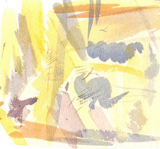
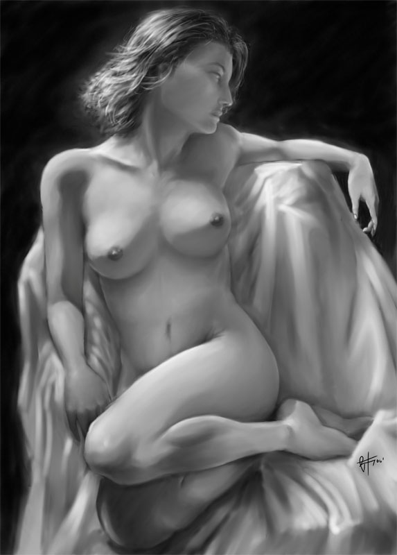
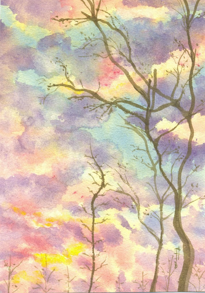
Nope. That's not the painting. :P You are looking at my look before you leap tool. I use this tiny piece of water color paper to test out my chosen colors. When this piece of paper starts to look harmonized then you'll know you picked the right colors. ;)
I think this piece of paper is proof that I'm still lacking in confidence and mastery of watercolors... I keep having to test out my brush load here before applying it on the paper.

Anyways on to the point of this post. I bought two books around late december to early january last year. It was Winsor & Newton's published books on watercolor landscapes and it's pretty helpful. It offered much insight into specific techniques or howto's on topics such as rocks, skies, mountains, water etc... I promised myself that I would test it out but I had to put that on hold as I've been otherwise preoccupied with... uhm... err... conquering the world. :D What can I say... watching 10,000 legionaires hack away at another 10,000 barbarians... it just brings tears to my eyes. (it saves me money too since I haven't been going out. :D)

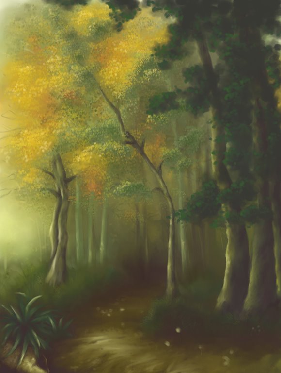
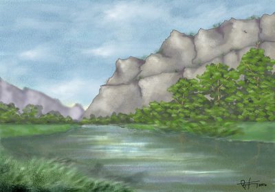
Fortunately I realized that this was taking me away from my... ahem... artistic retraining so yesterday I picked up a piece of watercolor paper dipped it in warm water for a minute or so, hung it to dry and when it was stretched I went on to make this:
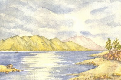
Lake Scene No. 1
10.7" x 7.2"
watercolors on watercolor paper(340 gsm)

So there's my somewhat successful painting. lolz. I did the excercise advised in the book. Followed his chosen palette and found that for the first time it actually matches the colors that I have in my box. :D

Here are a few things I learned in this excercise:

  • Never wear white shirt and shorts when you paint. One way or another the paint ends up on it. :P
  • It's possible to finish the painting in around 30 mins to an hour. I just spend so much time walking around, watching TV, eating, doodling and day dreaming in between sections that I end up finishing it in 4 hours. lolz. yep I take the term Leisure Painting to a whole new level.
  • Slow moving persons like me have 1 in a million chance in becoming a watercolor master if I don't change... atleast when I'm doing watercolors(hehe...). The timing is critical and my sky is clear evidence. I realise that preparing the colors you will need to paint a section (ex: sky) should be prepared in advance when you're painting wet-in-wet(watercolors... duh!). This becomes even more important if it will be necessary to lift colors at the end.
  • I have to remember to fade the colors as it goes farther so that depth is simulated.
  • I should use more water when I'm doing a section in which color lifting will be necessary.
  • I must not fear. Fear is the mind killer. I must face my fear, I must let it pass thru me. When my fear is gone only I shall remain. Oops... got carried away there. :P
That's all folks. Till next painting session. ;)
p.s. first one to find the house gets a kiss from me... you know tiny chocolates from hershey's? yep... just one. :P
-----------------------------------------------------------------------------------------------------------------------------------
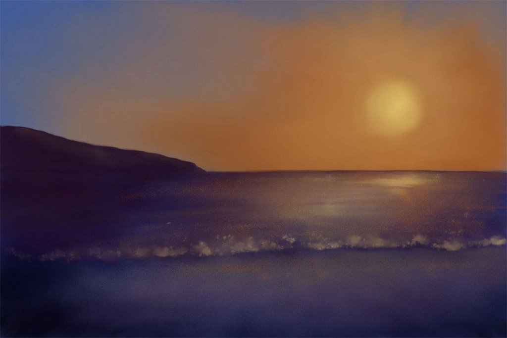
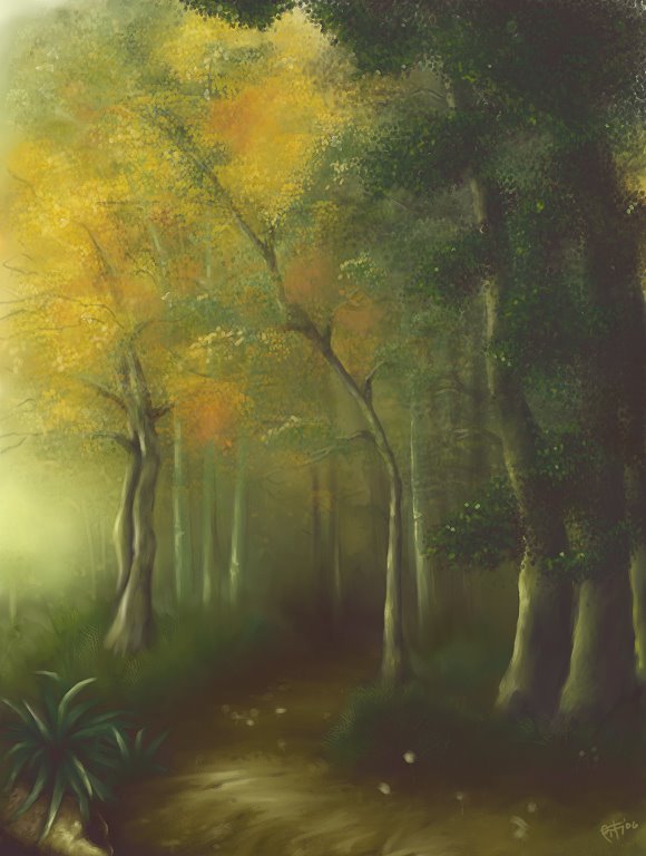
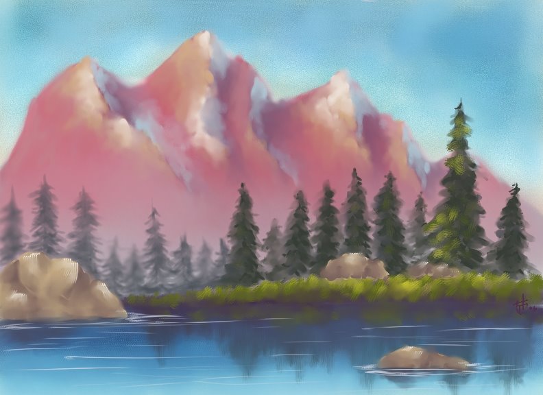
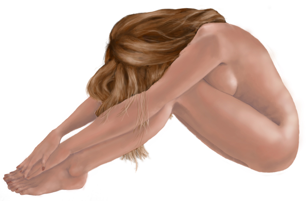
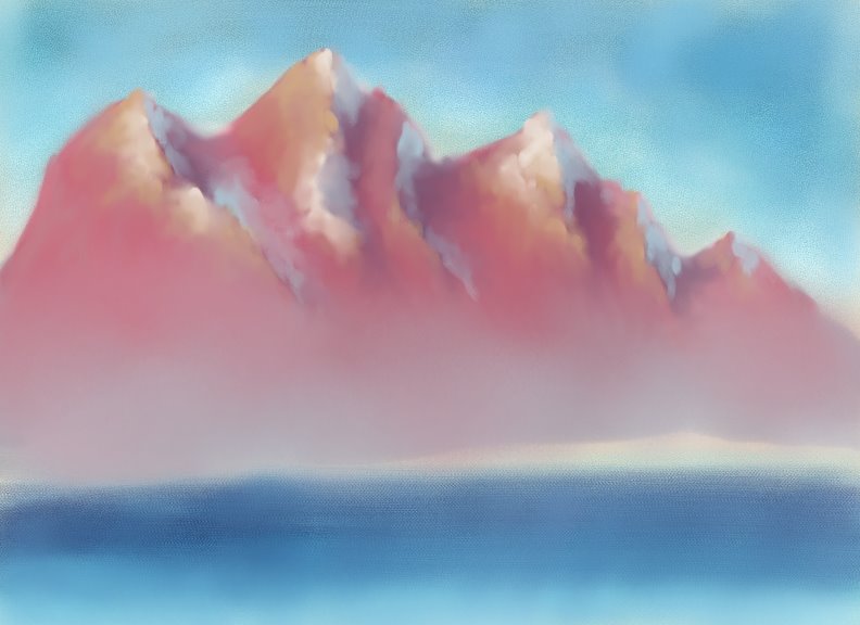
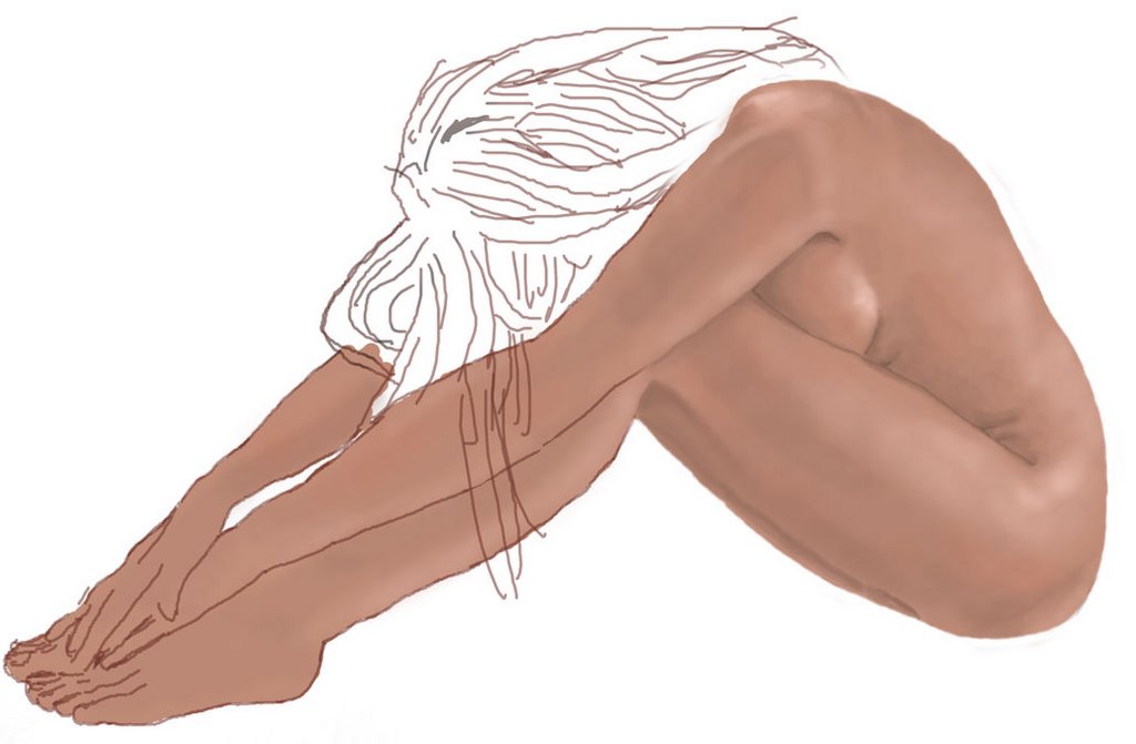
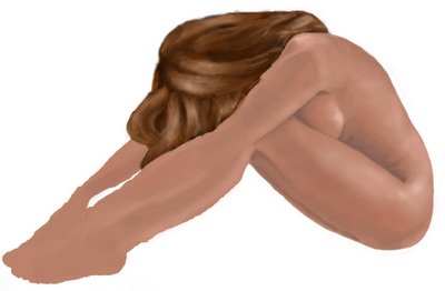
5:14 p.m. - Here's a little something I doodled in Photoshop while waiting for my off. :D

Painted with a mouse... I think I'll have to rest my arm for 7 years. lolz

It looks like crap but atleast I'm discovering new things. I made custom brushes on the fly and used and abused the dodge and burn tools. I think that mountain looks silly... don't get me started on the rest. lolz.

Would it be too much to ask if someone gave me a gift one of these days and when I open the box it turns out to be Corel Painter? Yeah... that would be too much...